Nevron .NET Vision
Framework / Presentation Layer / Editors / Appearance Styles Editors / Fill Style Editor

In This Topic
    Fill Style Editor
    In This Topic

    The Nevron Fill Style Editor provides complete visual editing for the properties, which get or set an instance of the NFillStyle class. It is exposed by the NFillStyleTypeEditor class.

     Applying the Editor to a Property

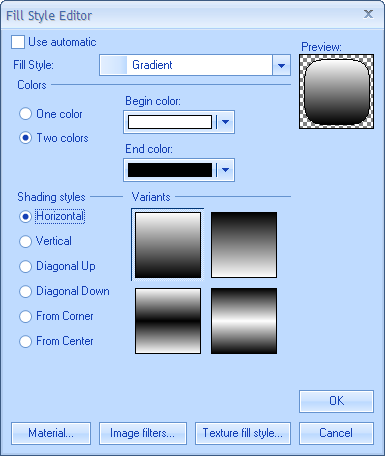
    The following example demonstrates how to apply the fill style type editor to a property:

    C#
    Copy Code
    // Fill Style property edited by the fill style editor
    [Editor(typeof(NFillStyleTypeEditor), typeof(UITypeEditor))]
    public NFillStyle FillStyle
    {
        get
        {
      return m_FillStyle;
        }
        set
        {
      m_FillStyle = value;
        }
    }
    
    Visual Basic
    Copy Code
    ` Fill Style property edited by the fill style editor 
    <Editor(GetType(NFillStyleTypeEditor), GetType(UITypeEditor))> _
    Public Property FillStyle() As Nevron.GraphicsCore.NFillStyle
        Get
      Return m_FillStyle
        End Get
        Set(ByVal Value As Nevron.GraphicsCore.NFillStyle)
      m_FillStyle = Value
        End Set
    End Property
    
     Showing the Editor from Code

    The NFillStyleTypeEditor can also be used to show the Fill Style Editor via the Edit static method. For example:

    [Visual Basic]
    Dim inFillStyle As NFillStyle = New NColorFillStyle(Color.Red)
    Dim resultFillStyle As NFillStyle
    Dim okPressed As Boolean = NFillStyleTypeEditor.Edit(inFillStyle, False, resultFillStyle)
    
    [C#]
    NFillStyle inFillStyle = new NColorFillStyle(Color.Red);
    NFillStyle resultFillStyle;
    bool okPressed = NFillStyleTypeEditor.Edit(inFillStyle, false, out resultFillStyle);
    

    This method returns a boolean value, which indicates whether the user pressed the OK button. The actual type of the resulting fill style depends on the selected item in the Fill Style combo box. The following table illustrates this relation:
     

    Fill Style Combo Box Item Fill Style Type
    Color NColorFillStyle
    Gradient NGradientFillStyle
    Image NImageFillStyle
    Hatch NHatchFillStyle
    Advanced Gradient NAdvancedGradientFillStyle

    Following is a brief description of the Fill Style Editor User Interface:

    • Use automatic check - the fill style editor can optionally have its Use automatic check enabled. If it is enabled the initial state of the check indicates whether the currently edited fill style belonged to the object exposing the edited fill style property, or was automatically obtained from the framework (via style inheritance or other property inheritance mechanism). If you check the Use automatic check and click on the OK button the resulting fill style will be null.
    • Material button - edits the material style associated with the filling (only applicable in 3D). The material style of the object defines the way in which the object reflects light.
    • Image filters buttons - lets you edit the image filters applied to the object image (only applicable in 2D). Invokes the Image Filters Style Editor.
    • Texture fill style button - for fill style types, which represent a texture (gradient, pattern, image etc.) you can edit the way in which the texture is mapped to the object.
    • Fill Style combo - defines the type of fill style that you want to apply and automatically displays the selector corresponding to that type of fill style.
    • Color Selector - the color selector provides the possibility to specify one of the following types of colors: standard, web, system or custom. The transparency of the color can also be edited:


    • Gradient Selector - the gradient selector provides the possibility to specify a gradient based on one or two colors and visually select a shading style:


    • Image Selector - with the image selector you can specify a raster image as an object filling.
      To add a new image in the gallery click on the 
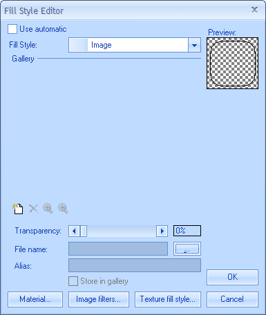
button and browse to the desired image.
      To change the location of an image from the gallery click on the  
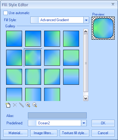
button and pick a new image.
      In the Alias text box you can set a name for each image in the gallery.
      If the Store in gallery check box is checked the image will be saved in the gallery, even if the application was closed.
      The transparency of the fill style is specified by Transparency scroll bar.


    • Hatch Selector - the hatch selector provides a set of predefined hatch patterns whose foreground and backgroung colors can be changed.


    • Advanced Gradient Selector - with the advanced gradient selector along with the predefined advanced gradients, it is possible to build your own custom gradients.

    See Also