Nevron Chart\Web Forms\ThinWeb\CSS Customization
Nevron Diagram\Web Forms\ThinWeb\CSS Customization
The ThinWeb control uses CSS style rules to modify the appearance of different chart or diagram HTML elements. The CSS used for this purpose is configurable from the ServerSettings.Css object. This topic discusses the different aspects of CSS customization as well as some properties that control the measurement of different HTML elements.
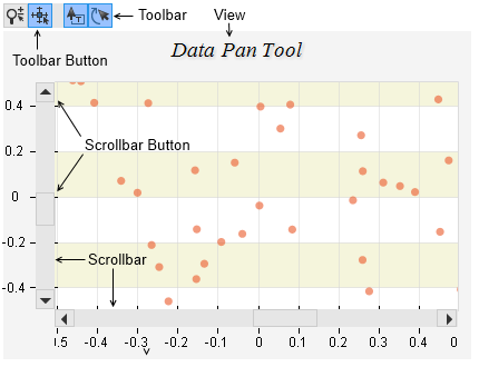
The following picture shows the different HTML elements in the ThinWeb control:

Each of this elements accepts one or more CSS styles depending on its type and state. In general the CSS styles used by the control can be grouped in three categories:
Element Based
These are CSS styles applied on different HTML elements. The NView, NScrollbar, NToolbar, NToolbarButton, NToolbarSeparator, NScrollbar and NTooltip fall into this category.
State Based
These are CSS styles that are applied depending on the state of the HTML element and are used by the buttons and the zoom selection range. This category contains NStateDefault, NStateDisabled, NStateChecked, NStateHover, NStatePressed, NZoomInSelection and NZoomOutSelection CSS styles.
System
The system CSS styles category contains the NNoSelect CSS style which is used to prevent the user from being able to select different HTML elements.
The following table summarizes the CSS styles used by the different elements:
| Element | CSS Styles |
| View | NView |
| Scrollbar | NScrollbar |
| Toolbar | NToolbar |
| Toolbar Button | NToolbarButton, NStateDefault, NStateDisabled, NStateChecked, NStateHover, NStatePressed |
| Toolbar Separator | NToolbarSeparator |
| Scrollbar Button | NStateDefault, NStateActive, NStateHover |
| Zoom Selection | NZoomInSelection, NZoomOutSelection |
| Tooltip | NTooltip |
In addition all elements have the NNoSelect CSS style which prevents the user from selecting them.
Modifying a Style Sheet
To modify the CSS code of a particular style you need to touch the thinWebControl.ServerSetting.Css.[StyleName] property. The following code for example modifies the appearance of the scrollbar background:
| C# |
Copy Code
|
|---|---|
|
thinWebControl.ServerSettings.Css.Scrollbar = @"margin : 0px; padding : 0px; border : 1px solid rgb(204, 204, 204); background: rgb(255, 255, 255);"; |
|
| Visual Basic |
Copy Code
|
|---|---|
| thinWebControl.ServerSettings.Css.Scrollbar = @"margin : 0px; padding : 0px; border : 1px solid rgb(204, 204, 204); background: rgb(255, 255, 255);" | |
Note that you cannot modify the style sheet name or selector.
Default Style Sheets
The following table lists the default style sheets used by the control:
| CSS Name | Value |
| NNoSelect |
-webkit-user-select: none; -khtml-user-select: none; -moz-user-select: none; -ms-user-select: none; -o-user-select: none; user-select: none; |
| NScrollbar |
margin : 0px; padding : 0px; border : 1px solid rgb(204, 204, 204); background: rgb(230, 230, 230); |
| NStateActive |
border: 1px solid rgb(38, 148, 232); background: rgb(153, 194, 255); |
| NStateDefault |
margin: 0px; padding: 2px; background: rgb(230, 230, 230); border : 1px solid rgb(204, 204, 204); |
| NStateDisabled |
background: rgb(211, 211, 211); |
| NStateHover |
border: 1px solid rgb(178, 199, 215); background: rgb(240, 240, 240); |
| NStatePressed |
padding-top: 3px; padding-bottom: 1px; border: 1px solid rgb(38, 148, 232); background: rgb(153, 194, 255); |
| NToolbar |
margin : 0px; padding-left : 0px; padding-top : 0px; padding-right : 0px; padding-bottom : 2px; |
| NToolbarButton |
padding: 2px; margin-right: 2px; width: 16px; height: 16px; |
| NToolbarSeparator |
width: 10px; height: 22px; font-size : 0px; background-color: rgb(230, 230, 230); |
| NTooltip |
cursor: pointer; margin: 0px; padding: 2px; text-align: center; font-size:10pt; border-style:solid; border-color:rgb(0, 0, 0); border-width:1px; background-color: rgb(255, 255, 255); |
| NView |
margin-left: 0px; margin-right: 0px; margin-top: 1px; margin-bottom: 0px; padding: 0px; border-width: 0px; |
| NZoomInSelection |
background-color : rgb(0, 0, 255); opacity : 0.2; |
| NZoomOutSelection |
background-color : rgb(255, 0, 0); opacity : 0.2; |
Measurement
The CSS used by the control can affect the position of the HTML elements on the client. In order to produce correct HTML layout the CSS settings must be synchronized with the values of the following properties of the CSS object:
ViewInflate - controls the inflate caused by the NView CSS style - the default value is (0, 1) as the css for NView specified 1 pixel top margin. In general the values of this property must be computed as follows:
ViewInflate.Width = margin-left + margin-right + padding-left + padding-right + border.left + border-right
ViewInflate.Height = margin-top + margin-bottom + padding-top + padding-bottom + border-top + border-bottom
ToolbarInflate - controls the inflate caused by the NToolbar CSS style - the proper setting of this value is calculated in the same as ViewInflate except that you need to take into account the NToolbar CSS settings.
ToolbarButtonInflate - controls the inflate caused by the NToolbarButton CSS style.
ScrollbarInflate - controls the inflate caused by the NScrollbar CSS style.
ScrollbarButtonInflate - controls the inflate caused by the NScrollbarButton CSS style.
Nevron Chart\Web Forms\ThinWeb\CSS Customization
Nevron Diagram\Web Forms\ThinWeb\CSS Customization