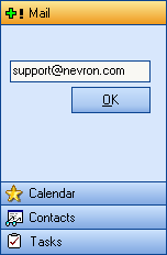
The Nevron Panel Bar is a generic container control which provides an easy and convenient way for storing large amount of controls within bands. It mimics the famous Outlook navigation bar and provides extensible rendering and customization features. Using this control makes it very easy to organize the navigation part of your application.
The NPanelBar control contains bands. The NBand is a separate control represented by a client area and a caption. It has two states - collapsed and expanded. Only one band in the collection may be in expanded state at a time. The user can toggle a band's state by clicking its caption. If the band is already expanded the click will perform no action. Programmatically, a band can be expanded by simply setting its state. Controls are added to a band via its ContainerPanel's Controls property.
The following example demonstrates how to create and use a NPanelBar control:
| C# |
Copy Code
|
NPanelBar bar = new NPanelBar();
bar.ImageList = this.imageList1;

//create two bands and add them to the bar
NBand band;
band = new NBand();
band.Caption = "My Band 1";
band.ImageIndex = 0;
band.TextAlign = HorizontalAlignment.Center;

//add some controls to the band, using its ContainerPanel property
TextBox textBox = new TextBox();
textBox.Text = "TextBox in a band";
band.ContainerPanel.Controls.Add(textBox);

bar.Bands.Add(band);

//hook to band events
bar.BandExpanding += new BandExpandingEventHandler(OnBandExpanding);
bar.BandExpanded += new BandEventHandler(OnBandExpanded);

...

private void OnBanExpanding(object sender, NBandCancelEventArgs args)
{
        NPanelBar bar = sender as NPanelBar;
        int bandIndex = bar.Bands.IndexOf(args.Band);
        if(bandIndex == 1)
                        args.Cancel = true;
}
private void OnBandExpanded(object sender, NBandEventArgs args)
{
        MessageBox.Show("Band expanded: " + args.Band.Caption);
}
|
| Visual Basic |
Copy Code
|
Dim bar As NPanelBar = New NPanelBar()
bar.ImageList = Me.imageList1

'create two bands and add them to the bar
Dim band As NBand
band = New NBand()
band.Caption = "My Band 1"
band.ImageIndex = 0
band.TextAlign = HorizontalAlignment.Center

'add some controls to the band, using its ContainerPanel property
Dim textBox As TextBox = New TextBox()
textBox.Text = "TextBox in a band"
band.ContainerPanel.Controls.Add(textBox)

bar.Bands.Add(band)

'hook to band events
AddHandler BandExpanding, AddressOf OnBandExpanding
AddHandler BandExpanded, AddressOf OnBandExpanded

...

Private Sub OnBanExpanding(ByVal sender As Object, ByVal args As NBandCancelEventArgs) Handles bar.BandExpanding
    Dim bar As NPanelBar = TryCast(sender, NPanelBar)
    Dim bandIndex As Integer = bar.Bands.IndexOf(args.Band)
    If bandIndex = 1 Then
        args.Cancel = True
    End If
End Sub

Private Sub OnBandExpanded(ByVal sender As Object, ByVal args As NBandEventArgs) Handles bar.BandExpanded
    MessageBox.Show("Band expanded: " + args.Band.Caption)
End Sub
|
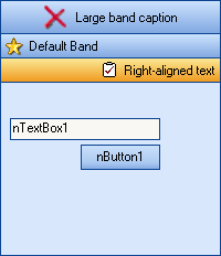
You can control caption height, image index, text align and image size per band. Caption rendering depends on the parent Panel Bar palette and renderer.
You have access to the currently expanded band in the panel bar via its
GetExpandedBand method.