The bridge between a NControlBorder object and control is the INControlBorderProvider interface. Each provider knows its default border style, default base color, whether the border is currently hot and its size, and a NControlBorder object. By default the Style and BaseColor values of the NControlBorder field are empty and the default values are used. If there are user-defined values they are used.
Some controls use the so called interactive borders - they display different type of border when not hovered (focused).
The following example demonstrates how to customize border appearance of a NListBox control:
| C# |
Copy Code
|
|---|---|
NControlBorder border = this.nListBox1.Border; border.Style = BorderStyle3D.Raised; border.BaseColor = Color.SlateGray; border = this.nListBox2.Border; border.Style = BorderStyle3D.RaisedFrame; border.BaseColor = Color.Brown; |
|
| Visual Basic |
Copy Code
|
|---|---|
Dim border As NControlBorder = Me.nListBox1.Border border.Style = BorderStyle3D.Raised border.BaseColor = Color.SlateGray border = Me.nListBox2.Border border.Style = BorderStyle3D.RaisedFrame border.BaseColor = Color.Brown |
|
The above code results in:


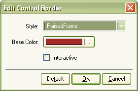
Nevron User Interface provides an intuitive and convenient way to edit border appearance of your controls. It exposes a visual editor available both at design and run-time.

Choose your favorite style from the "Style" combo, edit the desired base color and specify whether the border is interactive or not, and apply your settings using the "OK" button. You may always restore the default border appearance using the "Default" button.