Scale Label Style
In This Topic
All labels visualized on a scale have controllable style which allows you to modify various aspects of the label appearance and behavior. Since there are two types of labels - value labels and range labels, the first one denoting a value and the second a range on the scale respectively there are two label styles - NValueScaleLabelStyle and NRangeScaleLabelStyle. Both share a common base class called NScaleLabelStyle.
For labels that are automatically generated (for example labels that denote the values of the major ticks on a numeric scale) this style is exposed by the LabelStyle property of the configurator, which is shared by all labels that are automatically generated. Custom labels have a per label style, which is again exposed through a property called LabelStyle, but contained in the NCustomValueLabel or NCustomRangeLabel classes.
This topic will describes the different properties of the label style classes and how you can use them to achieve the desired looks of your charts and gauges.
Label Angle
You control the label angle through the Angle property of the label style. The following code will tell the primary X axis to rotate labels at 90 degrees.
| C# |
Copy Code
|
|
NChart chart = nChartControl1.Charts[0];
NAxis primaryX = chart.Axis(StandardAxis.PrimaryX);
NStandardScaleConfigurator scale = (NStandardScaleConfigurator)primaryX.ScaleConfigurator;
scale.LabelStyle.Angle = new NScaleLabelAngle(ScaleLabelAngleMode.View, 90);
|
| Visual Basic |
Copy Code
|
|
Dim chart As NChart = NChartControl1.Charts(0)
Dim xAxis As NAxis = chart.Axis(StandardAxis.PrimaryX)
Dim scale As NStandardScaleConfigurator = CType(xAxis.ScaleConfigurator, NStandardScaleConfigurator)
scale.LabelStyle.Angle = New NScaleLabelAngle(ScaleLabelAngleMode.View, 90)
|
Notice that when you specify a scale label angle you also need to set its angle mode. The following table shows the possible angle modes:
| ScaleLabelAngleMode |
Description |
| View |
The angle is specified in chart view space. This means that the angle will have the specified angle (in degrees) regardless of the axis 2D or 3D position. |
| Scale |
The angle is specified in scale space. This means that the angle will be relative to the axis orientation at the value or range denoted by the label. For example when you set scale label angle of 90 degrees with ScaleLabelAngleMode.Scale to a horizontal scale the labels will be rotated. If you apply this setting to a vertical axis the labels will not be rotated. |
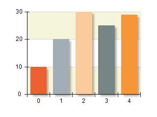
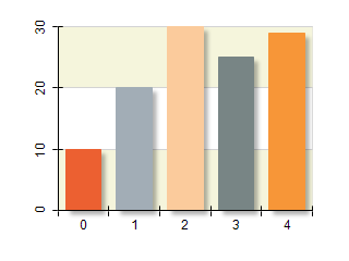
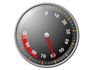
The following pictures shows several charts and gauges with different settings for this property:
| Chart with Y axis labels using ScaleLabelAngleMode.View, 0 degrees |
Chart with Y axis labels using ScaleLabelAngleMode.Scale, 0 degrees |
 |
 |
| Gauge with axis labels using ScaleLabelAngleMode.View, 0 degrees |
Gauge with axis labels using ScaleLabelAngleMode.Scale, 0 degrees |
 |
 |
You may also tell the axis angle whether it will allow texts to flip (that is have right to left reading direction). The following code disables flipping:
| C# |
Copy Code
|
|
NChart chart = nChartControl1.Charts[0];
NAxis primaryX = chart.Axis(StandardAxis.PrimaryX);
NStandardScaleConfigurator scale = (NStandardScaleConfigurator)primaryX.ScaleConfigurator;
scale.LabelStyle.Angle.AllowTextFlip = false;
|
| Visual Basic |
Copy Code
|
|
Dim chart As NChart = NChartControl1.Charts(0)
Dim xAxis As NAxis = chart.Axis(StandardAxis.PrimaryX)
Dim scale As NStandardScaleConfigurator = CType(xAxis.ScaleConfigurator, NStandardScaleConfigurator)
scale.LabelStyle.Angle.AllowTextFlip = False
|
Keeping Labels Inside Ruler
When a label is placed on the scale its bounds may fall outside the ruler range. You can force both value and range labels to be completely inside the ruler range if possible by setting the KeepInsideRuler property to true. By default this property is enabled for range labels and disabled for value labels.
| C# |
Copy Code
|
|
NChart chart = nChartControl1.Charts[0];
NAxis primaryX = chart.Axis(StandardAxis.PrimaryX);
NStandardScaleConfigurator scale = (NStandardScaleConfigurator)primaryX.ScaleConfigurator;
scale.LabelStyle.KeepInsideRuler = true;
|
| Visual Basic |
Copy Code
|
|
Dim chart As NChart = NChartControl1.Charts(0)
Dim xAxis As NAxis = chart.Axis(StandardAxis.PrimaryX)
Dim scale As NStandardScaleConfigurator = CType(xAxis.ScaleConfigurator, NStandardScaleConfigurator)
scale.LabelStyle.KeepInsideRuler = True
|
Label Visibility
Label visibility is controlled by setting the label style VisibilityMode property. This property allows you to control the visibility of a label based on its position on the scale. The following table shows the possible options:
| ScaleLabelVisibilityMode |
Description |
| Always |
The label is always visible and no check is performed for its relative position against the ruler. This is the default setting for value labels. |
| CenterInRuler |
The label is visible when its center lies inside the ruler range. |
| TextInRuler |
The label is visible when its text is completely inside ruler. |
| TextIntersectsRuler |
The label is visible when its text bounds intersect the ruler range. This is the default setting for range labels. |
The following code will change the label visibility mode of automatic labels in order to display them only when they are completely inside the ruler bounds:
| C# |
Copy Code
|
|
NChart chart = nChartControl1.Charts[0];
NAxis yAxis = chart.Axis(StandardAxis.PrimaryY);
NStandardScaleConfigurator scale = (NStandardScaleConfigurator)yAxis.ScaleConfigurator;
scale.LabelStyle.VisibilityMode = ScaleLabelVisibilityMode.TextInRuler;
|
| Visual Basic |
Copy Code
|
|
Dim chart As NChart = NChartControl1.Charts(0)
Dim yAxis As NAxis = chart.Axis(StandardAxis.PrimaryY)
Dim scale As NStandardScaleConfigurator = CType(yAxis.ScaleConfigurator, NStandardScaleConfigurator)
scale.LabelStyle.VisibilityMode = ScaleLabelVisibilityMode.TextInRuler
|
The following pictures show how the VisibilityMode and KeepInsideRuler properties work together:
| Scale with labels using ScaleLabelVisibilityMode.Always |
Scale with labels using ScaleLabelVisibilityMode.TextInRuler |
Scale with labels where KeepInsideRuler is set to true |
 |
 |
 |
Range Label Style
The NRangeLabelStyle associated with range labels builds on top of the functionality provided by the NScaleLabelStyle base class by adding features specific to range labels. Therefore the following sections apply to range labels only.
Wrapping Text
Since range labels denote a range on the scale it is possible to determine the maximum space they should occupy. By default all range labels will wrap the text they display to the range they denote. To disable text wrapping you must set the WrapText property to false. The following code will create a range label without text wrapping on the X axis:
| C# |
Copy Code
|
|
NChart chart = nChartControl1.Charts[0];
NCustomRangeLabel customLabel = new NCustomRangeLabel();
customLabel.Range = new NRange1DD(20, 40);
customLabel.Text = "Some Long Text";
customLabel.Style.WrapText = false;
chart.Axis(StandardAxis.PrimaryX).ScaleConfigurator.CustomLabels.Add(customLabel);
|
| Visual Basic |
Copy Code
|
|
Dim chart As NChart = NChartControl1.Charts(0)
Dim customLabel As New NCustomRangeLabel()
customLabel.Range = New NRange1DD(20, 40)
customLabel.Text = "Some Long Text"
customLabel.Style.WrapText = False
chart.Axis(StandardAxis.PrimaryX).ScaleConfigurator.CustomLabels.Add(customLabel)
|
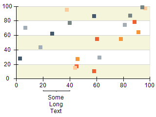
The following pictures show the effect of text wrapping:
| Chart with custom range label that does not use wrapping |
Chart with custom range label that uses wrapping |
 |
 |
Range Label Tick Mode
Each range label will also generate a range tick on the scale that pinpoints the range denoted by the range. You can control the tick mode by changing the TickMode property of the NRangeScaleLabelStyle class. The following table shows the available options:
| RangeLabelTickMode |
Description |
| None |
The range label does not render ticks |
| Separators |
The range label tick is visualized as two separators at the left and right of the range annotated by the label |
| Top |
The range label tick is attached to the top of the label (this is the default) |
| Center |
The range label tick is attached to the center of the label |
Hierarchical and range timeline configurators use RangeLabelTickMode.Separators by default.
The following code shows hot to change the range label tick mode of a custom range label:
| C# |
Copy Code
|
|
NChart chart = nChartControl1.Charts[0];
NCustomRangeLabel customLabel = new NCustomRangeLabel();
customLabel.Range = new NRange1DD(20, 40);
customLabel.Text = "Some Long Text";
customLabel.Style.WrapText = true;
customLabel.Style.TickMode = RangeLabelTickMode.Separators;
chart.Axis(StandardAxis.PrimaryX).ScaleConfigurator.CustomLabels.Add(customLabel);
|
| Visual Basic |
Copy Code
|
|
Dim chart As NChart = NChartControl1.Charts(0)
Dim customLabel As New NCustomRangeLabel()
customLabel.Range = New NRange1DD(20, 40)
customLabel.Text = "Some Long Text"
customLabel.Style.WrapText = False
customLabel.Style.TickMode = RangeLabelTickMode.Separators
chart.Axis(StandardAxis.PrimaryX).ScaleConfigurator.CustomLabels.Add(customLabel)
|
Padding and Offset
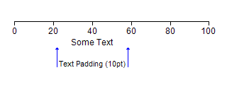
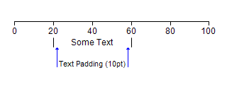
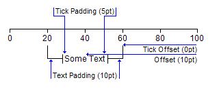
The TickPadding, TickOffset, TextPadding and Offset properties work together to determine the offset of the range tick lines from the text as well as the vertical position of the range tick lines and text on the scale. They have different meaning depending on the tick mode. The following pictures show how these properties work together depending on the TickMode of the label:
| RangeLabelTickMode.None - in this mode only TextPadding and Offset properties have any effect (as the label will not show a range tick). The picture below shows how text padding has limited the available space for the label. If the label uses wrapping if will fit in the range denoted by the blue lines: |
 |
| RangeLabelTickMode.Top - in this mode TickPadding, TickOffset, TextOffset and Offset properties work together to determine the label appearance as shown on the picture below: |
 |
| RangeLabelTickMode.Separators - this mode is similar to RangeLabelTickMode.None as only the TextPadding and Offset properties are regarded. The blue lines on the picture below show the available space for the label text. If the label does not use wrapping and is longer than the range then the separators will be hidden. |
 |
| RangeLabelTickMode.Center – in this mode TickOffset, Offset and TextPadding have the same meaning as when the label ticks operate in RangeLabelTickMode.Top. The TickPadding property in this case is used to control the distance of the center lines from the label text as shown on the picture below: |
 |
The following code creates the label on the last picture (showing RangeLabelTickMode.Center):
| C# |
Copy Code
|
|
NChart chart = nChartControl1.Charts[0];
NCustomRangeLabel customLabel = new NCustomRangeLabel();
customLabel.Range = new NRange1DD(20, 60);
customLabel.Text = "Some Text";
customLabel.Style.WrapText = true;
customLabel.Style.TickMode = RangeLabelTickMode.Center;
customLabel.Style.Offset = new NLength(10);
customLabel.Style.TextPadding = new NLength(10);
customLabel.Style.TickOffset = new NLength(0);
customLabel.Style.TickPadding = new NLength(5);
chart.Axis(StandardAxis.PrimaryX).ScaleConfigurator.CustomLabels.Add(customLabel);
|
| Visual Basic |
Copy Code
|
|
Dim chart As NChart = NChartControl1.Charts(0)
Dim customLabel As New NCustomRangeLabel()
customLabel.Range = New NRange1DD(20, 40)
customLabel.Text = "Some Long Text"
customLabel.Style.WrapText = False
customLabel.Style.Offset = New NLength(10)
customLabel.Style.TextPadding = New NLength(10)
customLabel.Style.TickOffset = New NLength(0)
customLabel.Style.TickPadding = New NLength(5)
chart.Axis(StandardAxis.PrimaryX).ScaleConfigurator.CustomLabels.Add(customLabel)
|
Related Examples
Windows Forms : Axes \ General \ Custom Range Labels
Windows Forms : Gauge Gallery \ Gauges \ Axes \ Custom Range Labels
Web Forms: Axes \ General \ Custom Range Labels
Web Forms: Gauge Gallery \ Gauges \ Scales \ Custom Range Labels
See Also
